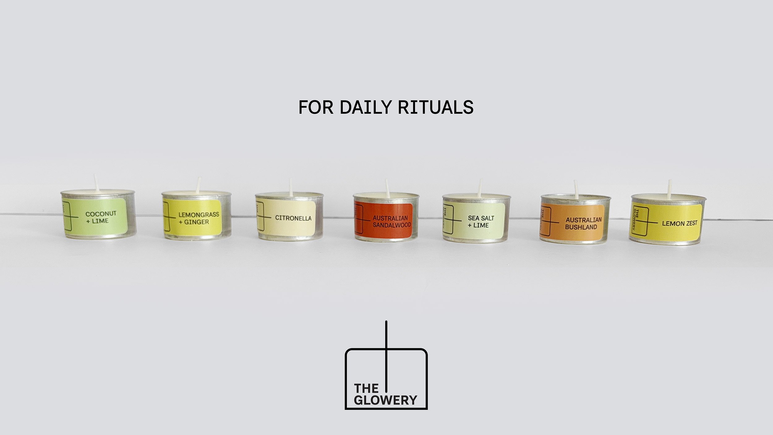
A little something handmade
for every day.
Designed and hand-poured in Brisbane.
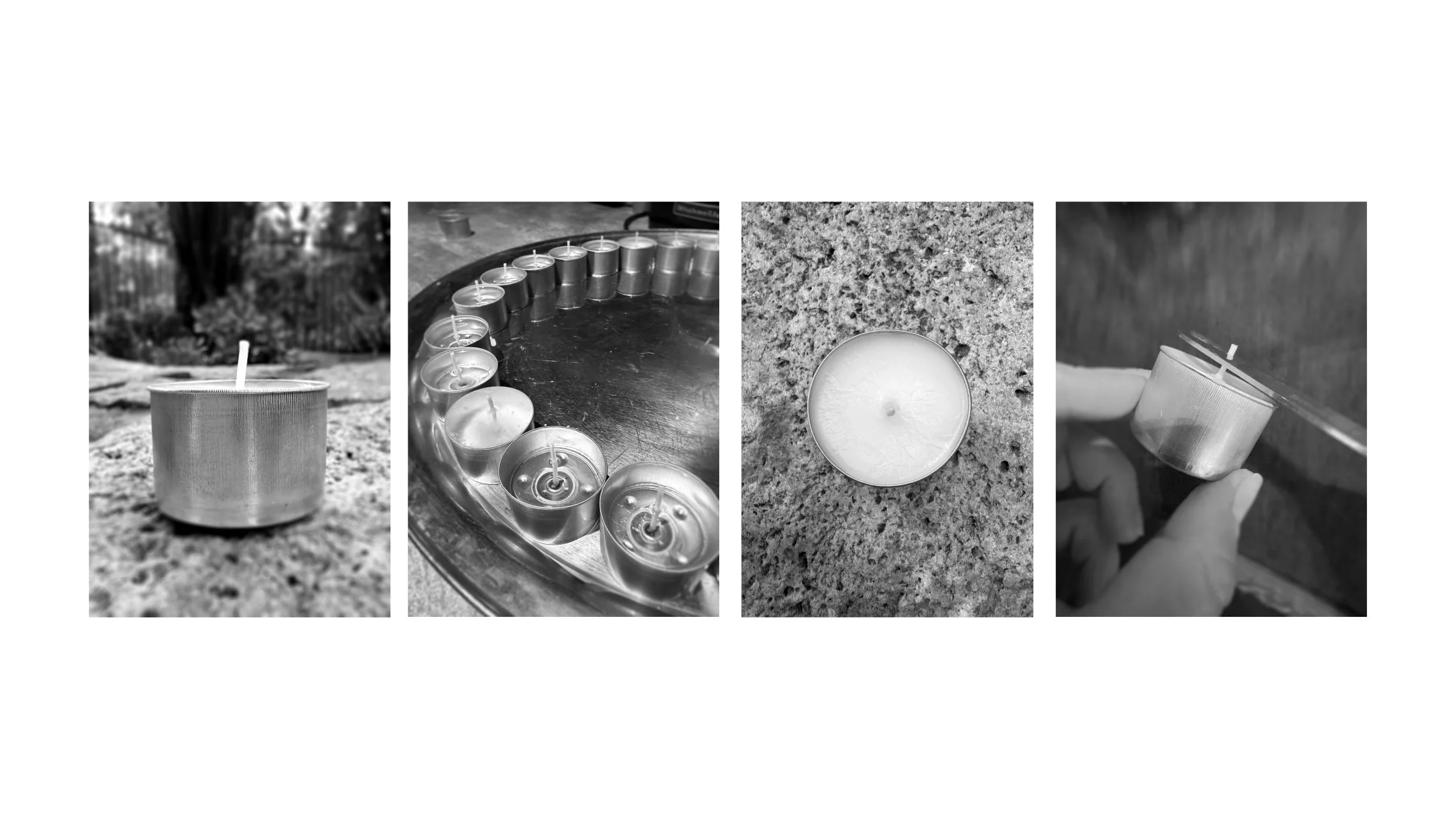
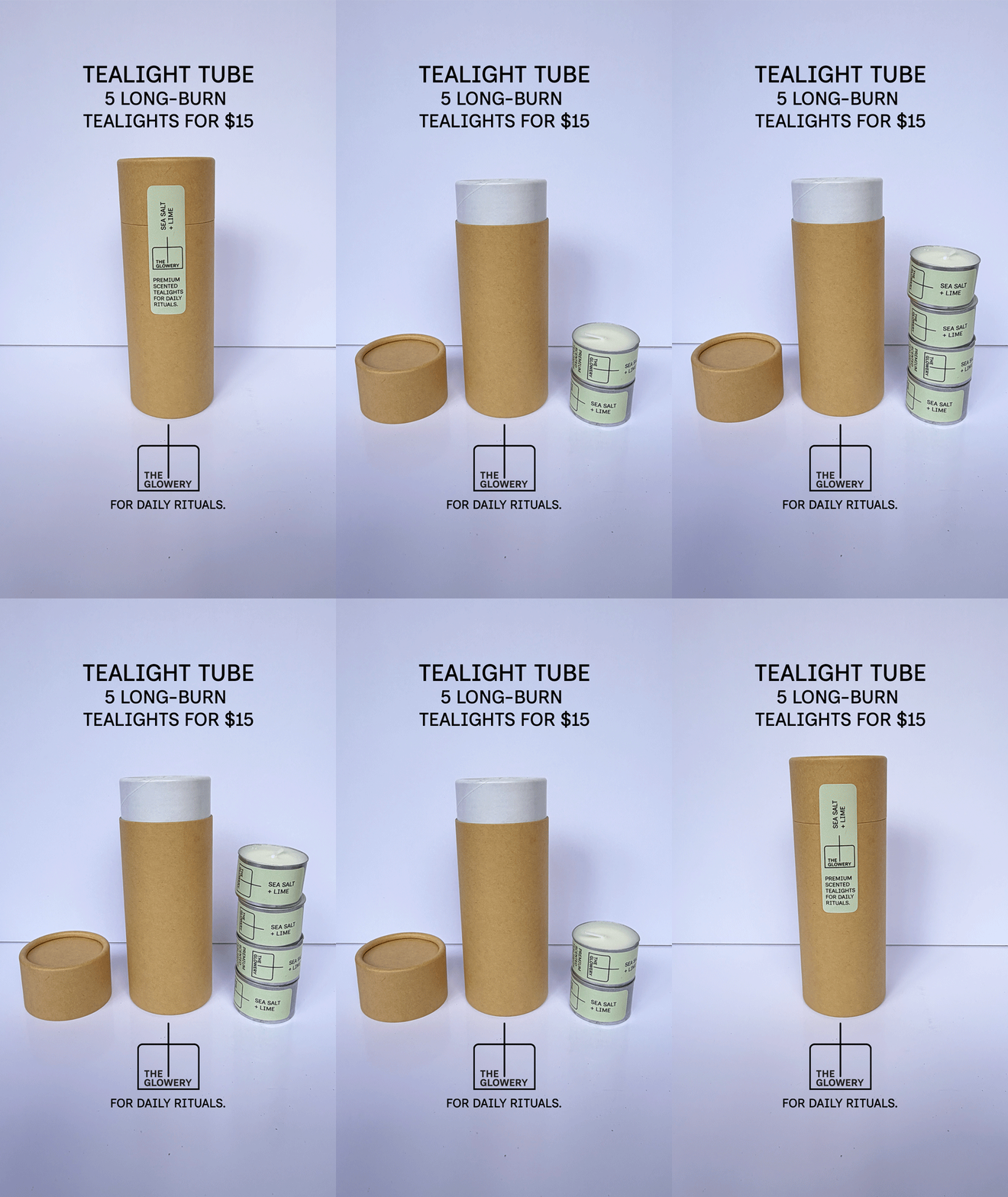
Brand strategy, identity, packaging, product development and e-commerce
The Glowery is a small maker brand I created from the ground up — from developing and hand-pouring the candles to naming, building the brand, packaging and online store around them.
The idea began with a simple gap. Most readily available tealights are cheap, paraffin-based, heavily coloured or barely scented, while many handmade candle brands sit firmly in the world of luxury and gifting. I wanted to make something in between: premium, long-burn scented tealights made with quality materials, but designed to be lit and enjoyed every day.
The fragrance range was curated around two ideas: scents that enhance the moment you’re in, and scents that evoke a place, mood or memory.
But the brand is about more than candles. The Glowery is a celebration of making things, enjoying things and the pleasure that comes from something created by another person.
Made by a person. Made to be enjoyed.
I developed the product through hands-on testing of wax, fragrance, vessels, wicks and burn performance, alongside the positioning, naming, tone of voice, identity, packaging, photography direction, e-commerce and launch.
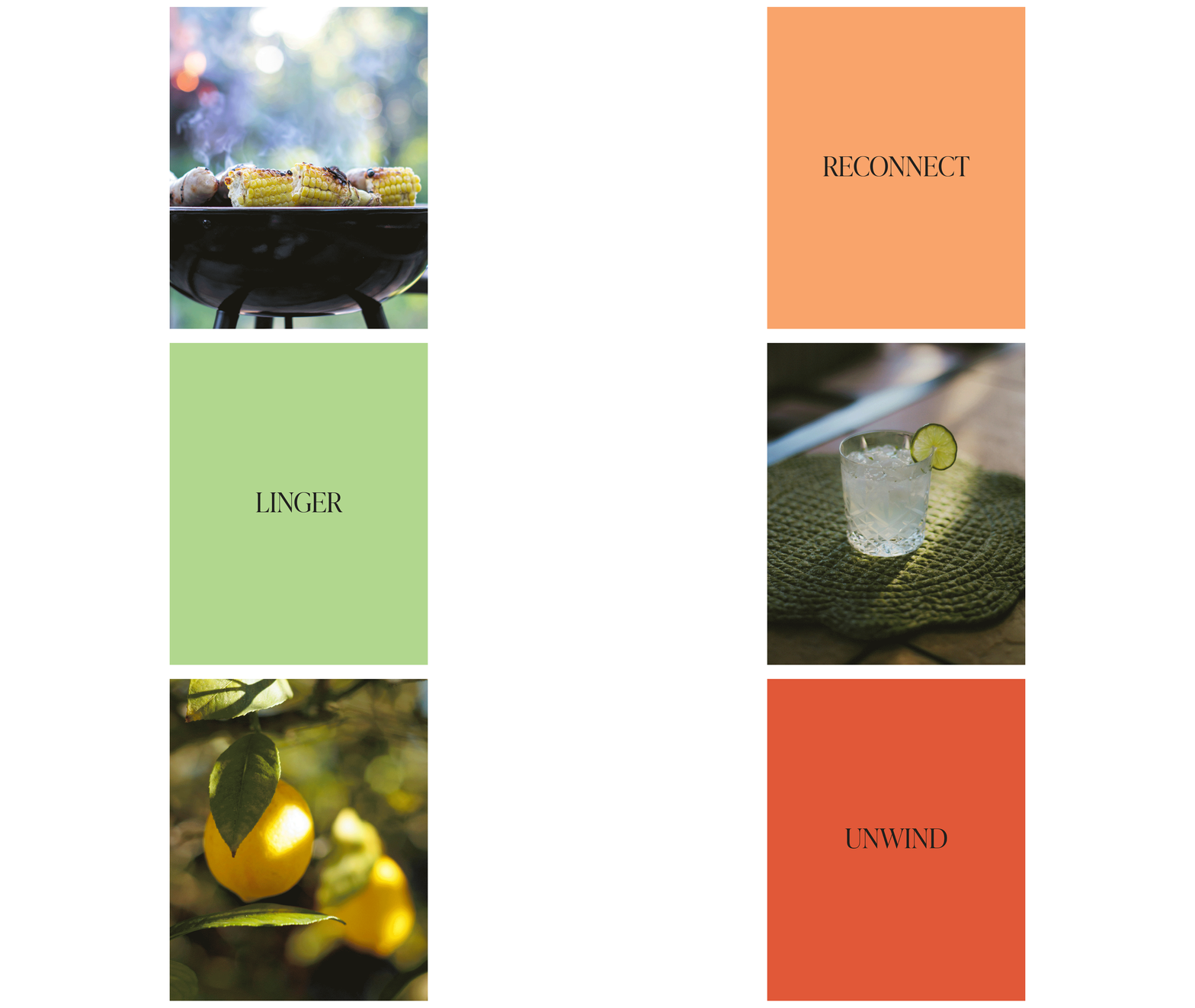
The visual approach is deliberately simple and human. Clean typography and restrained layouts give the product room to breathe, while the creative is intentionally imperfect rather than highly polished. Stop-motion animation, handmade movement, natural light and small inconsistencies are part of the language of the brand. It should feel like a person made it, because a person did.
Photography follows the same principle. I use imagery from Unsplash and credit the photographers whose work helps tell the story — extending the idea of recognising and valuing people who make things.
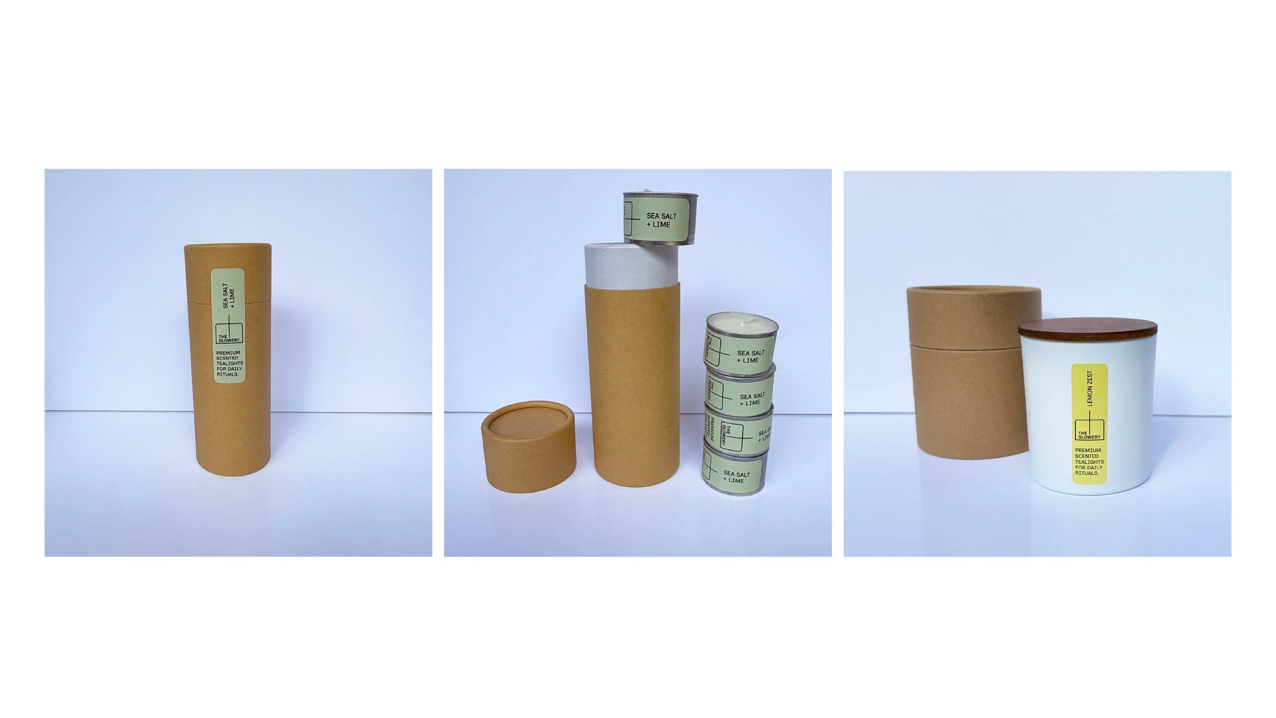
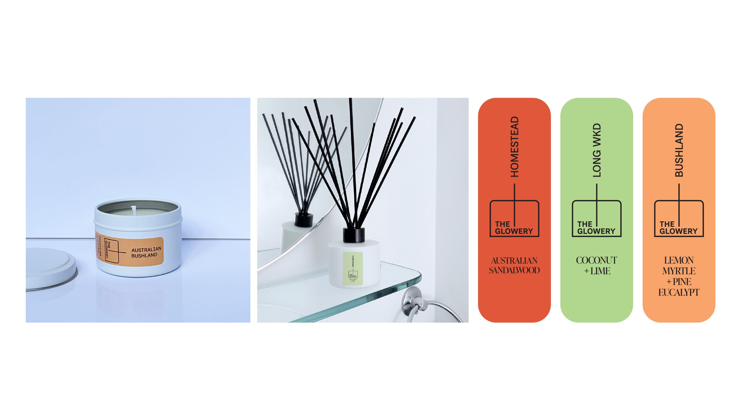
The packaging system is designed to be simple, consistent and practical. The cylindrical tube format carries across the range, the logo proportions are taken directly from the dimensions of the aluminium tealight cup and pre-trimmed wick, and a single 70×20 mm address label works across every product and packaging format.
The result is a brand that feels considered without feeling precious: premium but accessible, handmade but contemporary, and designed around the small rituals that make everyday life better.