O’DO. Made over time. Wood fired every time.
Eaten in no time.
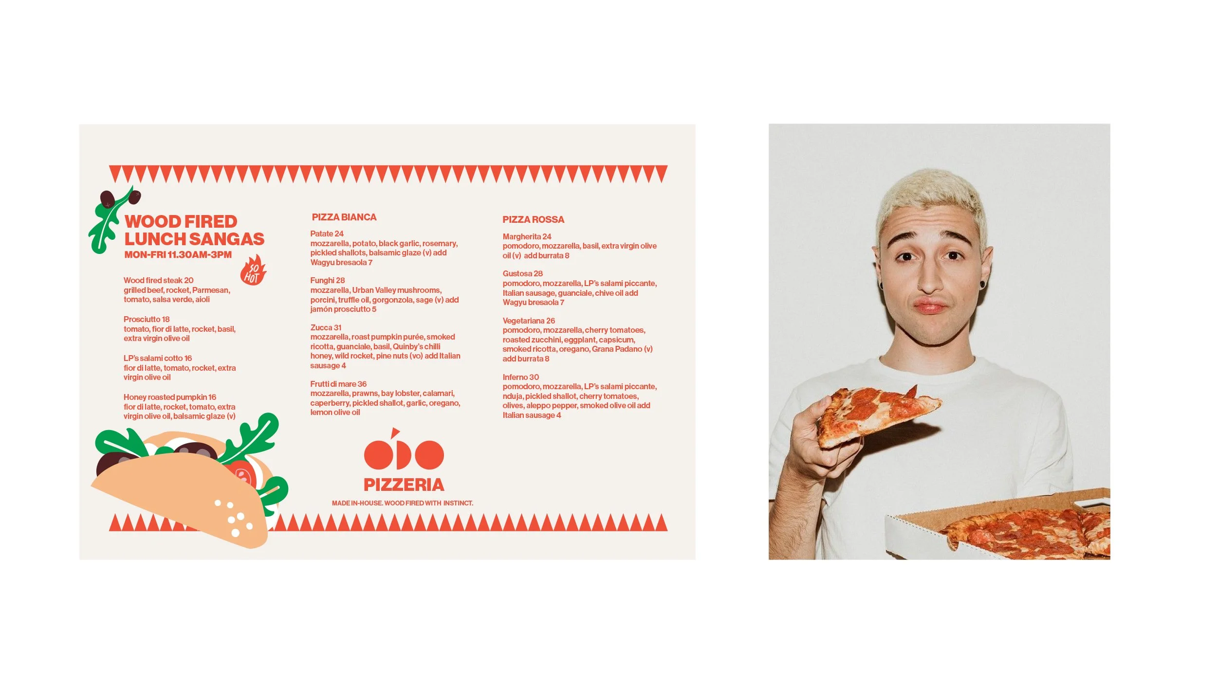
O’DO is short for the two things that matter most: pomodoro and 00 flour.
That’s where good pizza starts. The rest is heat, time and instinct.
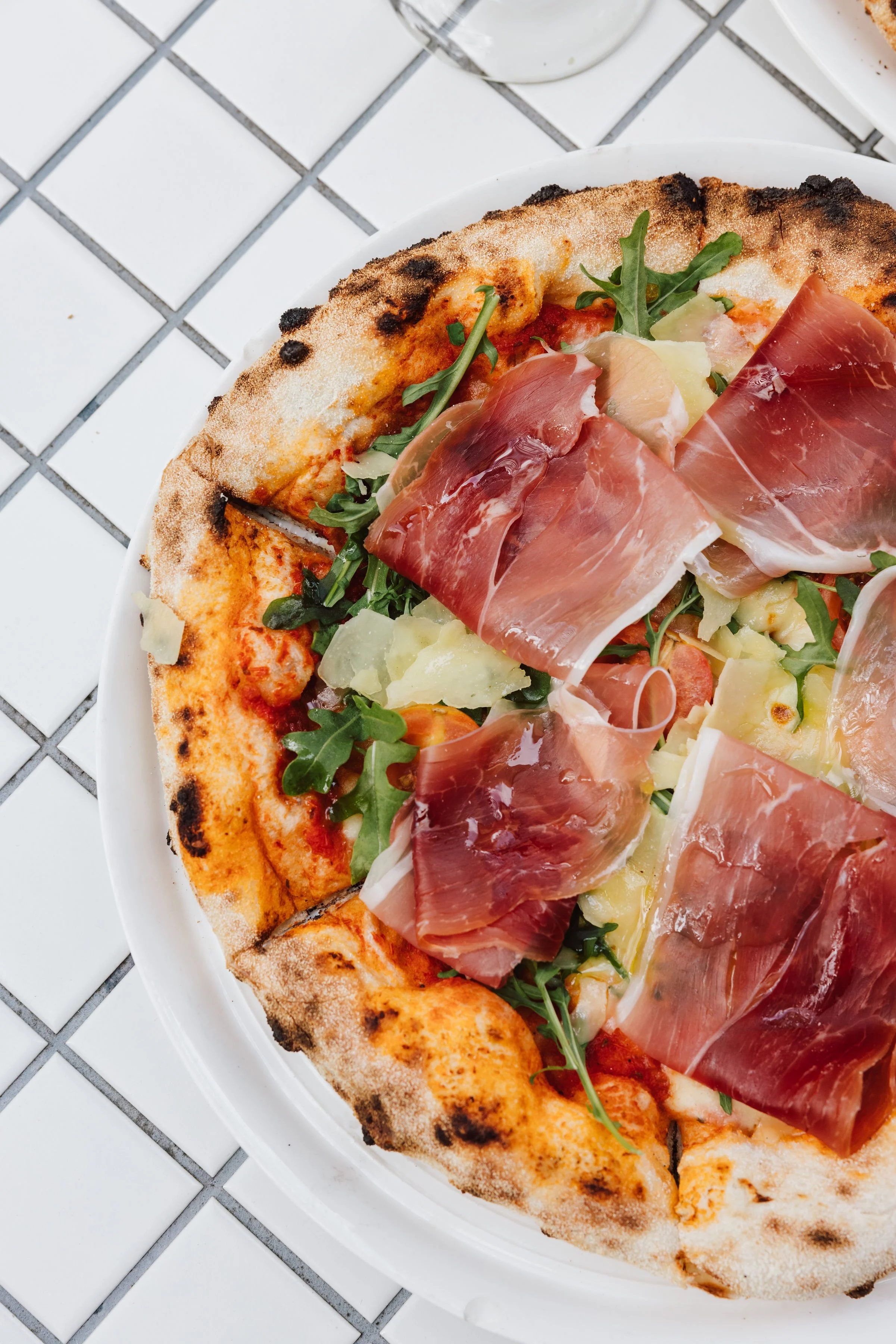
The dough’s made right, the sauce hits hard and the toppings know when to stop.
O’DO. Say it loud. Eat it hot.
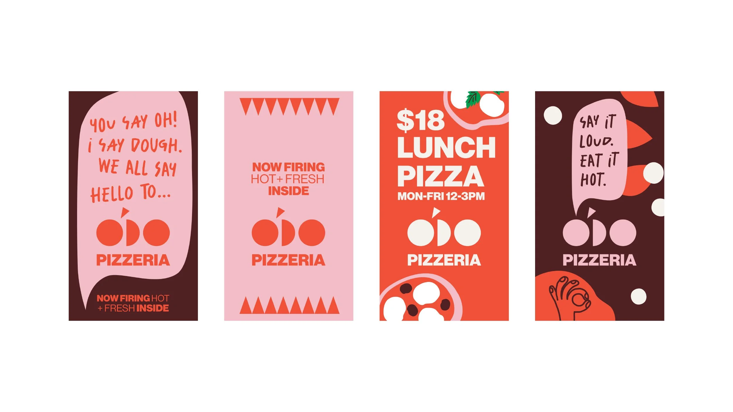
Creating a pizza brand built for modern hospitality.
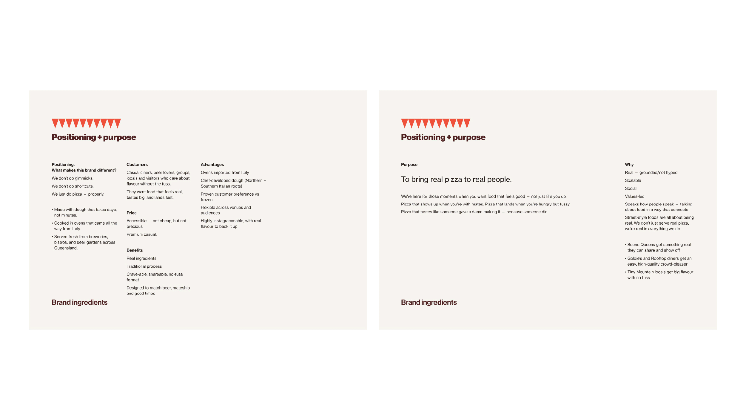
O’DO was developed from the ground up as a new pizza concept within a growing hospitality portfolio — from naming and positioning through to tone of voice, visual identity and launch direction.
The challenge was creating a brand that felt distinctive without becoming overly styled or self-conscious. In a category crowded with traditional Italian cues and trend-driven branding, O’DO needed to feel warm, simple and instantly recognisable — designed to work as both a customer experience and an operationally scalable venue brand.
Services
Brand strategy, naming, positioning, tone of voice, creative direction, identity design and copywriting.
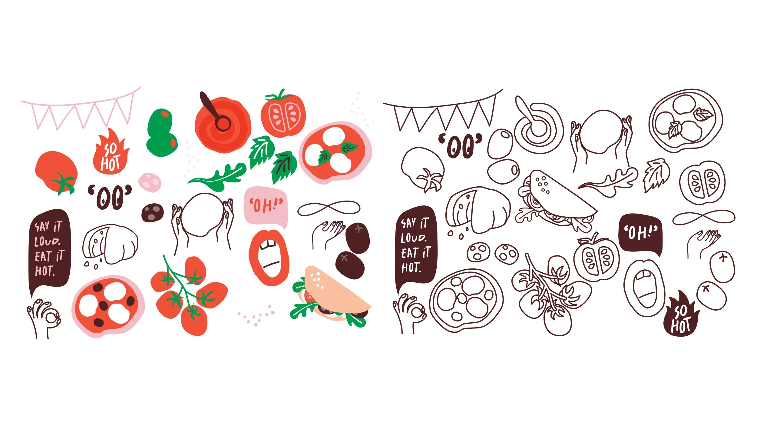
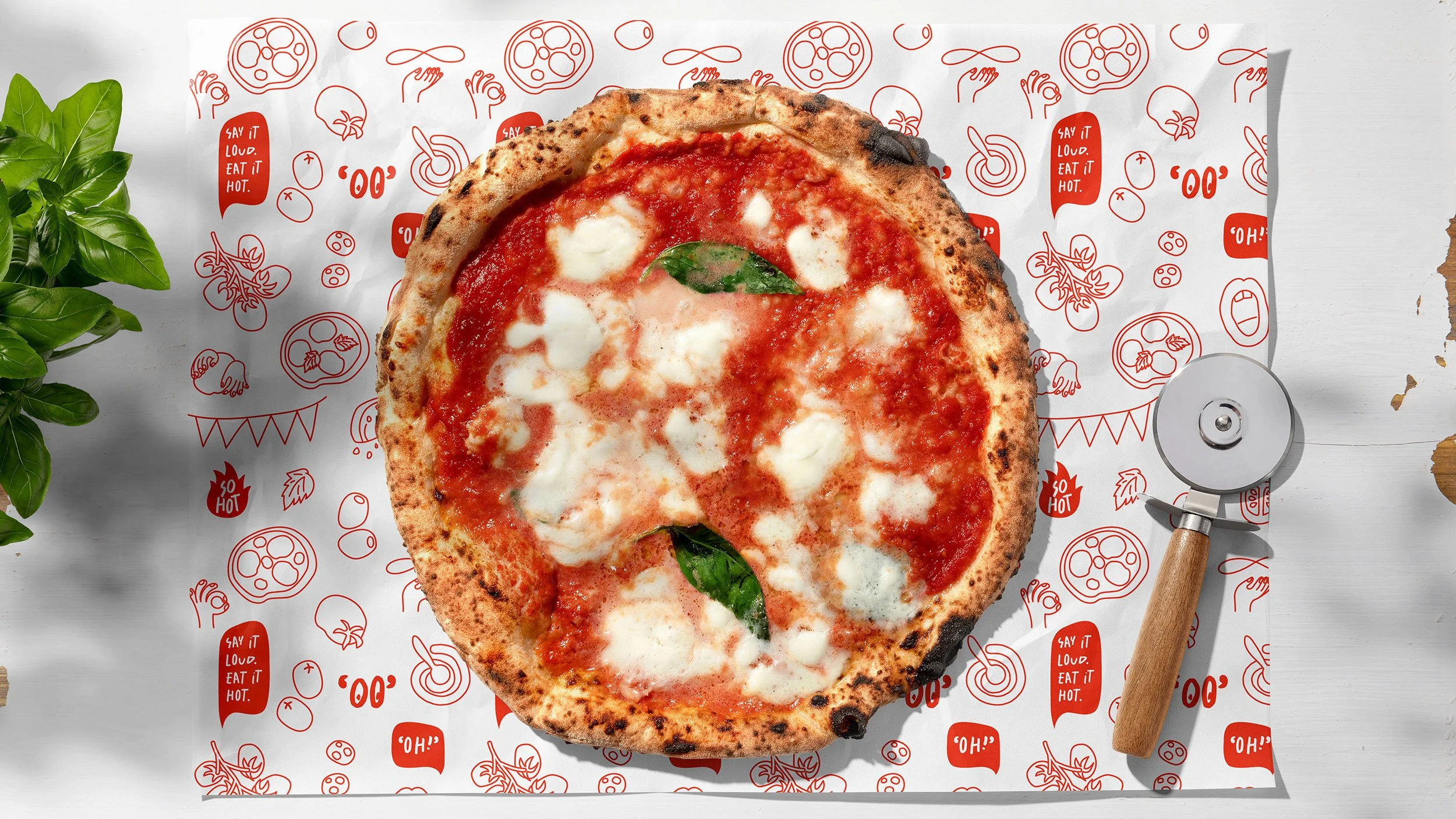
The name O’DO draws from pomodoro, “00” flour and the playful sound of “oh dough” — creating a brand that feels conversational, memorable and full of personality without trying too hard.
The wider brand system was designed to balance modern simplicity with warmth
and familiarity, creating a flexible identity that could work naturally across menus, packaging, signage, digital content and the in-venue experience.
Rather than leaning into heavy nostalgia or traditional trattoria styling, the positioning focused on something more immediate and social — good food, good energy and pizza that feels made to be shared.